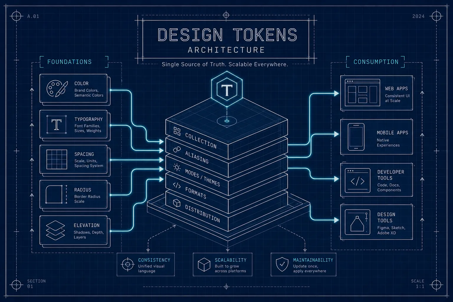
What are design tokens, and how are they used?
A design token is a named design decision stored as data. Here is how one value travels from a Figma file to a CSS custom property in production.
In most products there is a colour that exists four times over: as a fill in a Figma file, as a Sass variable, as an Android colour resource, and as a hex value somebody typed straight into a component in a hurry. Changing the brand means finding all four. Missing one is how a button ends up a shade nobody chose.
Design tokens are the answer to that, and the answer is narrower than the word suggests. A design token is a named design decision stored as structured data, so those four copies become one source and three generated outputs. This article follows a single value the whole way: what makes it a token rather than a variable, how the DTCG format stores it, what an alias does, and what a build step actually emits at the other end.
A design token is a named decision, not a value
The value 16 is a number. The token space.md is a decision about how far apart
related things sit. That difference is the entire point, because the name survives a
change of value and the value does not survive anything.
This is also why a token is not simply a CSS custom property or a Figma variable. Those are places a token can be applied. The token itself is the record of the decision, held somewhere both design tools and build tools can read it, in a form that carries its own type.
DTCG stores a token as JSON with a $value and a $type
The W3C Design Tokens Community Group
publishes the format most tooling now targets. In the
2025.10 Format module, every property
the specification defines is prefixed with a dollar sign, and the rule for what counts as
a token is exact: an object with a $value property is a token, and an object without
one is a group that contains tokens.
{
  "space": {
    "$type": "dimension",
    "md": {
      "$value": { "value": 16, "unit": "px" },
      "$description": "Default gap between related elements"
    }
  }
}
Two things in that snippet do real work. $type is declared once on the space group
and inherited by every token inside it, which keeps large files from repeating
themselves. And the dimension is an object holding a number and a unit rather than the
string "16px", so a consumer never has to parse a value to find out what unit it is in.
DAES Token Manager stores tokens in this shape from the moment they are typed in Figma, so the JSON committed to a repository is the same object the plugin edits rather than a conversion of it.
Aliases are what make one change reach everything
A token can reference another token by name instead of holding a value. The reference is written as a dot path in curly braces:
{
  "space": {
    "$type": "dimension",
    "md": { "$value": { "value": 16, "unit": "px" } }
  },
  "card": {
    "padding": { "$value": "{space.md}" }
  }
}
card.padding has no value of its own and no declared type. Both are resolved from the
token it points at. Change space.md to 20px and every token aliasing it moves with
it, across every platform, without anyone editing a component.
This is the mechanism that separates a token system from a file full of named constants. A list of constants still requires a human to know which ones should change together. Aliases put that knowledge into the data.
The build step turns tokens into CSS custom properties
The token file is not what a browser reads. A build tool sits between them, and Style Dictionary is the one most teams use. It reads the source JSON and writes platform files, so the same two tokens above come out as:
:root {
  --space-md: 16px;
  --card-padding: var(--space-md);
}
The alias survives the transformation rather than being flattened into a duplicated value, which means the relationship is still visible in the generated CSS. The same source emits Android resources and iOS constants from the same run. No platform keeps its own copy, and no platform is the source.
Where design tokens are used in UI development
Day to day, the answer is: in the places a value used to be hard-coded. A component
references var(--card-padding) instead of 16px. A theme switch swaps which primitives
the semantic tokens resolve to, rather than overriding a hundred component rules.
The reason this matters is narrower than "consistency". It is that the number of places a design decision is written down drops to one. How you layer those decisions once there are more than a handful is a separate question, covered in what design token architecture is. Everything downstream is generated, and generated things do not drift. What remains is deciding which decisions are worth naming, which is a design problem that no format solves for you.
Are design tokens just variables with extra steps?
Do I need every token type before this is useful?
Can Figma variables hold my whole token system?
The DTCG 2025.10 Format module is the primary source for how tokens, groups and aliases are defined, and the Style Dictionary documentation covers how that file becomes platform output.