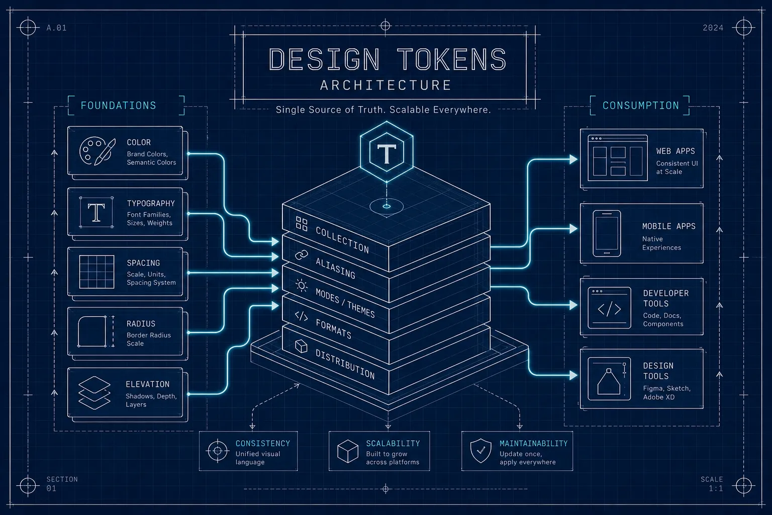
What is design token architecture?
Design token architecture is the layering that keeps a token system changeable. Here is what the three tiers do and the rule that holds them together.
A flat list of three hundred tokens works perfectly well. It keeps working right up to the day someone asks for a dark mode, or a second brand, or an Android build, and then it stops working all at once.
Design token architecture is what prevents that. It is not a bigger token file or a stricter naming policy: it is the decision to layer tokens by the job each one does, so that a change enters the system at exactly one point and travels outwards on its own. Three tiers do that work, and one rule about which direction references may point keeps the tiers from dissolving back into a flat list.
Flat token lists collapse at the second consumer
In a flat file, button-background holds #1D4EDB and so do eleven other tokens that
happen to want the same blue. Nothing in the data says whether those twelve are the same
decision or a coincidence.
That ambiguity costs nothing while there is one theme and one platform. Introduce a dark mode and someone has to work out, by reading names, which of the twelve should change and which should not. Introduce a rebrand and the same archaeology happens again, under time pressure, by whoever is available. The file was never wrong. It just never recorded the difference between a value and a decision, so the knowledge stayed in people's heads.
Primitives, semantic and component tokens do different jobs
The three-tier model is the shape most public design systems converge on, including Material Design 3. Each tier has one job, and mixing the jobs is what reintroduces the flat-list problem.
| Tier | Holds | References | Example |
|---|---|---|---|
| Primitive | Literal values, nothing else | Nothing | color.blue.500 |
| Semantic | Purpose, by pointing at a primitive | Primitives only | color.action.background |
| Component | One element's decision | Semantic tokens only | button.primary.background |
Primitives are the only tier where a real value appears, in the DTCG shape described in what design tokens are. They describe what something is, never what it is for, which is why they are never referenced from a component directly. A ramp of ten blues is a palette, not a set of decisions.
Component tokens sit at the other end and are the most specific thing in the system. They exist so a single element can deviate without that deviation leaking into anything else.
Semantic tokens are where theming actually lives
The middle tier does the work people expect the whole system to do. A semantic token names a purpose and points at a primitive, and swapping which primitive it points at is what a theme change is.
{
  "color": {
    "text": {
      "primary": { "$value": "{color.grey.900}" }
    }
  }
}
In a dark mode file, color.text.primary resolves to {color.grey.100} instead. Every
component that consumes it moves, and no component file is edited. That is the
compounding benefit of the tier: one decision point, applied everywhere it was ever used,
including places nobody remembers building.
This is also the tier that decides how much of your system is themeable at all. A component token that skips the semantic layer and points at a primitive is invisible to every theme you will ever add.
Naming is the interface the whole team touches
Structure without naming discipline does not survive contact with a second contributor.
The pattern that holds up reads from broad to narrow: category, then role, then variant,
then state. color.action.background.hover is legible six months later to someone who
was not there.
The failure that matters is naming by appearance instead of intent. color.text.red
becomes a lie the moment the brand red becomes an orange, and the lie is embedded in
every codebase that consumed it. color.text.danger stays true, because it named the
decision rather than the pixel.
Three conventions worth settling once and writing down:
- Semantic names for anything a component consumes, literal names only for primitives.
- One separator style per output target, with the dot path as the source of truth.
- States named explicitly rather than implied.
None of this is aesthetic. Inconsistent naming is what produces duplicate tokens and broken references, and a system nobody trusts is abandoned regardless of how well it is layered.
Components never reference primitives directly
That single rule is what keeps the architecture from decaying. References point one way, from component to semantic to primitive, and never upwards or sideways. Every shortcut past the semantic tier is a place a future theme will not reach.
The rule is also cheap to verify. Resolving every reference against the merged token tree is a mechanical check that catches wiring mistakes a review will not, which is worth running in a build rather than trusting to discipline. DAES Token Manager resolves aliases live while tokens are authored, so a broken reference surfaces in Figma rather than in a failed pipeline.
What the architecture cannot show you is how the decisions look once rendered. A token file describes structure, not the component someone shipped last quarter, which is the gap LookBook is built for: it captures patterns from Figma into a searchable gallery, so the rendered result of the system stays visible next to the structure that produced it.
Is three tiers always the right number?
Where do brand and density fit?
Does the DTCG format enforce this architecture?
Material Design 3's token documentation sets out one public version of this layering, and the DTCG 2025.10 Format module defines the alias mechanism the tiers are built on.